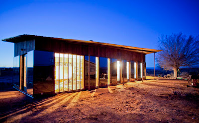
The Nakai House, recently posted online in Dezeen Magazine, was designed and built by University of Colorado students for Lorraine Nakai, a Navajo woman out in the Utah desert. The house appears to hit a lot of the right buttons in considering the clients aspirations, site conditions, harsh desert climate and budget. Good design, while often considered the province of those with means, is quite applicable in most every circumstance. See more @ http://www.dezeen.com/2012/12/11/nakai-house-by-university-of-colorado-students/ The proper attribution to those involved can be found there.
Friday, December 21, 2012
Saturday, December 1, 2012
Tuesday, November 20, 2012
A RANCH REVIVED - FLOOR PLANS
The original ranch style home was 2216 sf. Among its many flaws, these three were most interesting: 1) to enter the main bedroom one had to go through the bathroom with its sunken tub directly in the pathway, 2) another bedroom had no bathroom so one traipsed through the public areas to get to it, and 3) closets for two bedrooms had exterior doors accessing directly the entry porch. Design marvels!
The new, updated ranch home is 2468 sf. Many, many changes are incorporated into this new design including fixing the three flaws mentioned above. The home now has good flow, an open plan, dynamic vaulted ceilings, and lots of interior natural light. A multitude of skylights, a clerestory, bay windows, and gable end windows in the living room were added. An exceptional kitchen and pantry was created. It has beautiful cherry cabinets, granite counters and stainless appliances - these you would expect. More important, though, is the space, task and storage function. And the bathrooms - you would actually want to be in the new ones.
Monday, November 19, 2012
A RANCH REVIVED, PART 2
Saturday, November 10, 2012
PINOLEVILLE POMO NATION ART STUDIO
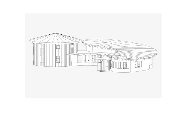
The Art Studio evolved around a circle on circle form,
focused toward the Basket and Regalia studios. These tall, high ceiling studios, have lots of north windows bring in the cool, balanced light ideal for creating their intricate, extraordinary baskets and ceremonial regalia. Looking out, the view, with your eye level @ 9' above grade, is directly into the rich, evergreen foliage of the oaks. Between the two main studios, a quiet patio is shared for work on nicer days. Two other studios are for arts and crafts, classes and socializing. To connect all the studios, a hallway gallery wraps the inner radius. Straw bale and timber construction anchor the organic form. Area: 4095 sf. Note: if you are not familiar with the Pomo people, do become acquainted with them. In particular,they are famous for their remarkable basketry.
focused toward the Basket and Regalia studios. These tall, high ceiling studios, have lots of north windows bring in the cool, balanced light ideal for creating their intricate, extraordinary baskets and ceremonial regalia. Looking out, the view, with your eye level @ 9' above grade, is directly into the rich, evergreen foliage of the oaks. Between the two main studios, a quiet patio is shared for work on nicer days. Two other studios are for arts and crafts, classes and socializing. To connect all the studios, a hallway gallery wraps the inner radius. Straw bale and timber construction anchor the organic form. Area: 4095 sf. Note: if you are not familiar with the Pomo people, do become acquainted with them. In particular,they are famous for their remarkable basketry.
Wednesday, October 31, 2012
AN ADU aka A 'GRANNY' UNIT
A last note: context is important in any design. You need to at least know the context in order to 'fit' in as seen here with the ADU in the middle. Or to stand in contrast.
Thursday, October 25, 2012
A RESIDENCE KITCHEN
The design goal for the A Residence is to transform this typical existing kitchen to serve the extended family. First - increase the size of the footprint so several people, many ages, can cook and help in the kitchen. 2nd - add work surfaces with more counters and an island. 3rd - add sinks. Sink #3 is for washing hands, particularly suited for this South Asian family. 4th - be sure there are lot's of cupboards and storage. 5th - maintain the open plan with the family/dining area. 6th - add additional counters for serving. 7th - improve the connection to outdoors. Put the main sink directly at the window. It is also good to note the design process with the A family was very collaborative. I welcome this.
Friday, October 19, 2012
PINOLEVILLE POMO NATION DESIGN COMPETITION
Recently Kumaran Design submitted an entry to the Pinole Pomo Nation, a Native American Nation in Northern California, for their proposed Living Culture Center. The emphasis was on zero energy buildings sensitive to the culture, place and what is sacred. To begin - the site plan.
Embodying Pomo culture, four buildings – in the
four directions – are sited counter clockwise around the sacred center.
Enclosed by a now completed circle of live oaks – seven new ones planted to
honor each of the seven elders.
While cohesive as a whole, the design and
building types for each building differ by intent. To inform, to give options,
even to manifest, one building at time.
Wednesday, September 19, 2012
DESIGN BUDGETS
For much of my career my focus was to build and design. In recent years my focus is to design, for others to build, for you. Early on I learned an important lesson that I am attentive to now. I estimated and bid on many projects designed by architects. Interestingly, for the majority of the homes, my bid and all the other bids were too high. Design flaw - too expensive. The projects never got built. What a waste. The owner's dreams dashed, their money wasted. The architect, though paid, wasted his or her time and everyone else's, including mine which also equals money. So how I approach the design and costs is to be frank - what is your budget? Then I try to design accordingly, pushing the value, utility and aesthetic to maximize what you choose to spend.
Saturday, September 15, 2012
BUILDINGS I LIKE
Scheduled to be opened soon - Herzog & de Mueron's new Parrish Art Museum on Long Island, NY. Rather different than the de Young you might say. Simple and direct . . . .
Photo credits unknown. Compliments of Dezeen and Phaidon
Friday, August 24, 2012
I AM NOT AN ARCHITECT . . .
I am not an architect .... yet I was classically trained to build architecture and to design architecture by Master Builders in the traditional way. If you look at the history of architecture and building you will find this not uncommon.
There can be a distinct advantage - experience in building. It helps to know how to build what you design. And to design what you know can be built.
There can be a distinct advantage - experience in building. It helps to know how to build what you design. And to design what you know can be built.
TYLER RESIDENCE
A very comfortable home for a family of 4, along with dogs and horses. Set on several acres with broad views to the east, the style is contemporary farmhouse. This floor plan is from the archives, never built. Too common in economic downturns.
Friday, August 10, 2012
PASSIVE PASSION
As I have been told, in 2020, all new houses in California are to be Net Zero Energy. While we have made progress in recent years, it seems a tall order. Yet if we design houses utilizing the Passive House Standard it is very doable. In fact it is being done.
Check out "Passive Passion" by Charlie Hoxie, http://www.foursevenfive.com/index.php?main_page=page&id=30&chapter=1.
Check out "Passive Passion" by Charlie Hoxie, http://www.foursevenfive.com/index.php?main_page=page&id=30&chapter=1.
Monday, August 6, 2012
DESIGN IS NOT LIKE DRIVING A CAR
In design, you have one foot on the gas and one foot on the brake. You step on the gas to rev up the creativity. But you keep the other foot on the brake to keep it practical, make it possible. This is hard on cars but it keeps design real.
Wednesday, August 1, 2012
FORM AND ENERGY
The Poetry House by Bruce Johnson.
Very much a favorite. Bruce is a dear friend and an extraordinary sculptor and artisan.
www.formandenergy.com
Very much a favorite. Bruce is a dear friend and an extraordinary sculptor and artisan.
www.formandenergy.com
Thursday, July 19, 2012
TWO LIGHT FIXTURES
Occasionally we have the opportunity to design and make light fixtures. Here are two examples, quite different in style, location and purpose:
The first shows one of a pair illuminating the entrance to a garden gate.
The second is an interior sconce in an asymmetric fan shape @ a stair well. Below it is a unique branch from a redwood tree.
© Kumaran Design 2012
The first shows one of a pair illuminating the entrance to a garden gate.
The second is an interior sconce in an asymmetric fan shape @ a stair well. Below it is a unique branch from a redwood tree.
© Kumaran Design 2012
Wednesday, July 18, 2012
KIND WORDS
I share this note, a letter of recognition to be sure, but you'll get a sense of how I approach design:
We think of Thamby Kumaran with gratitude and fondness every day: he designed and built the winery and office where we work; he designed, sited, and built the home we line in. He designed and built the adjacent home for our parents, with the special needs brought by their more of eight decades of living.
Every view, every carefully crafted piece of joinery, every relaxing place to work and serene setting in which to reflect and seek calmness has been touched by his vision, humanity and craft.
We chose a challenging property on the east side of Napa Valley high in the hills. No road, no buildings, unlimited opportunity to do it right or to do it wrong.
Somehow we found Thamby. He learned the spirit of the land and placed the buildings in just the right sites and at just the right scale. (Now, we know that he also learned our spirit and gently guided us to the right choices.) Thamby is simultaneously practical and visionary, disciplined and inventive, determined and collaborative.
We have worked with Thamby on three projects over a siz-year span. We have lived in the home he built for us for 14 years. We know we will seek his help for our next project, whenever and wherever it may be.
Leighton and Linda, St. Helena, CA
Leighton and Linda, St. Helena, CA
Saturday, July 7, 2012
DEXTER'S SHOP UPDATE - the first 8 months.
Received a call from Dexter recently. He shared how thrilled he is about how the auto repair shop performs. He never had to turn the heat on through this past winter. Though a radiant system was installed in the slab - he really wanted a 'warm' experience having spent dozens of years on an unheated shop floor. He just didn't need it. And he rarely turns on the lights during work days (unlike his previous shops). The south window wall + high windows around the east and north give plenty of general lighting. Dexter's Shop is a good example of simple passive solar design. Not needing and automotive shop? Passive solar design is applicable to most any building. (see previous post, DEXTER'S SHOP, dated 1/20/12)
Thursday, June 28, 2012
DESIGN
It is not always obvious but everything is designed. Whether designed well, middling or poorly - it has been designed.
So it is good to remember:
Good design creates value.
Good design saves you money.
Good design makes you money.
So it is good to remember:
Good design creates value.
Good design saves you money.
Good design makes you money.
Wednesday, May 30, 2012
JUST A COUPLE OF POTHOLES NEED FIXING
Visited the Tassjara Zen Mountain Center recently.
Along with the good food, hot soak and being near those seeking ultimate
reality , it was nice to view their newest building and these wonderful doors -
stile and rail with natural panels. Mike Laine built them. So sweet. It is worth your while to see more of his exquisite work - go to www.woodenheart.us
Sunday, May 27, 2012
100 MILE HOUSE
This house is designed to be simple and lively.
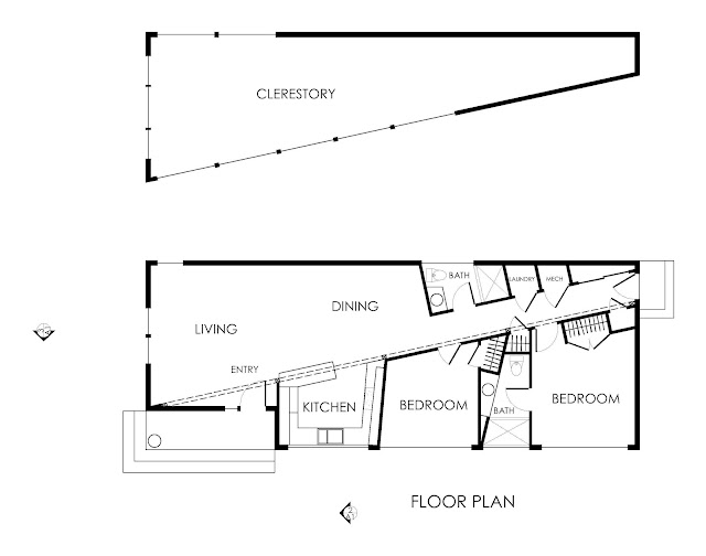
Simple as a basic rectangle yet energetic by the split diagonally, vertically, and up the roof slopes. The form is spacious, defining public and private areas. Natural light extends deeply to both. The home should be bright and uplifting through the long gray winters.
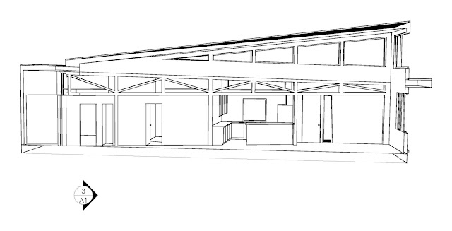
As a passive solar/passive house hybrid, the home will be comfortable and energy efficient. SIPS panels and high performance windows are the thermal skin. To avoid summer overheating, 3 native maple trees are planted. Heating to be hydronic radiant floors. Air quality via heat recovery ventilator. SIPS panels also provide the structural core. An exposed heavy timber truss carries the SIPS panels at the taller form down the split.
The exterior is to be either cedar shingles, light gray in color, or stucco, white color. The entry is strongly defined by a salvaged cedar log as the corner post supporting the covered porch. The porch ceiling is sky blue and the door is bright yellow.
At the interior, to enhance the light, walls are to be white, smooth dry wall. The floors are natural recycled fir. The ceilings are natural recycled cedar.
This house is designed to be comfortable and notable.
Do inquire for more details about the design submitted.
© KUMARAN DESIGN 2012
Subscribe to:
Comments (Atom)


